
110 ways to restyling a facade - Ca’ granda Tower case study
location:
Milano
ITALY
with:
Teicos group
Arch. Günter Pusch
ONPLUS
client:
private
year:
2021- in progress
program:
residential retrofit
status:
design development
Milano
ITALY
with:
Teicos group
Arch. Günter Pusch
ONPLUS
client:
private
year:
2021- in progress
program:
residential retrofit
status:
design development
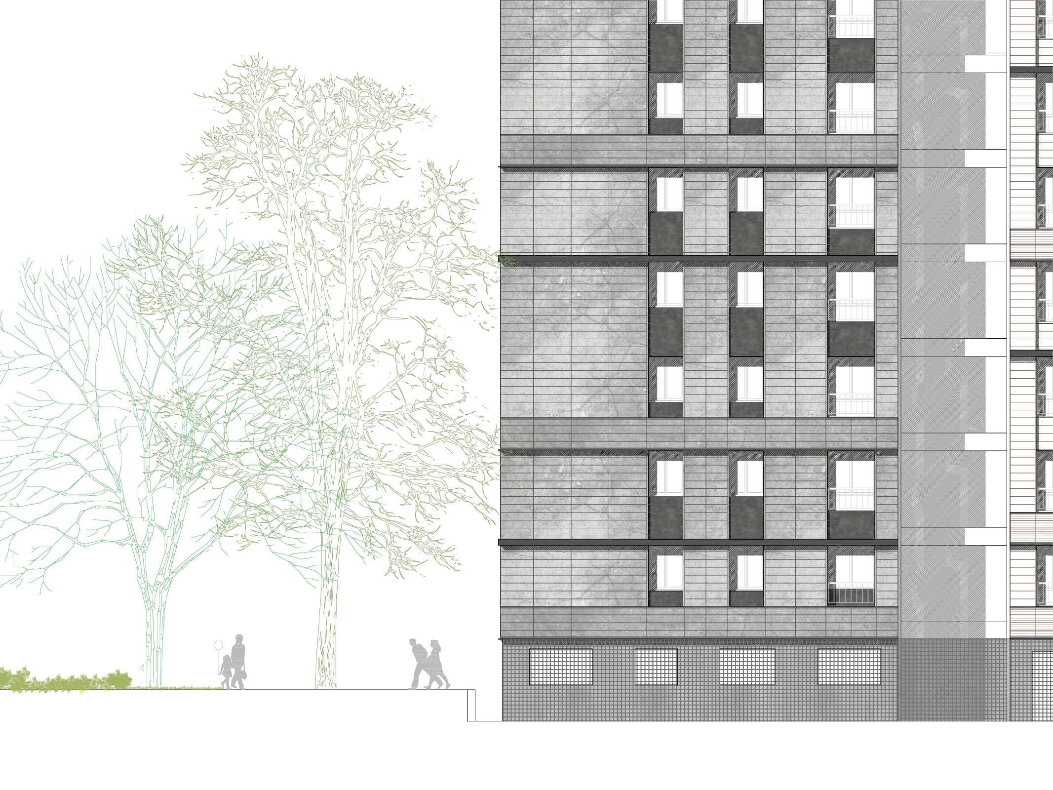
THE EXISTING FACADE
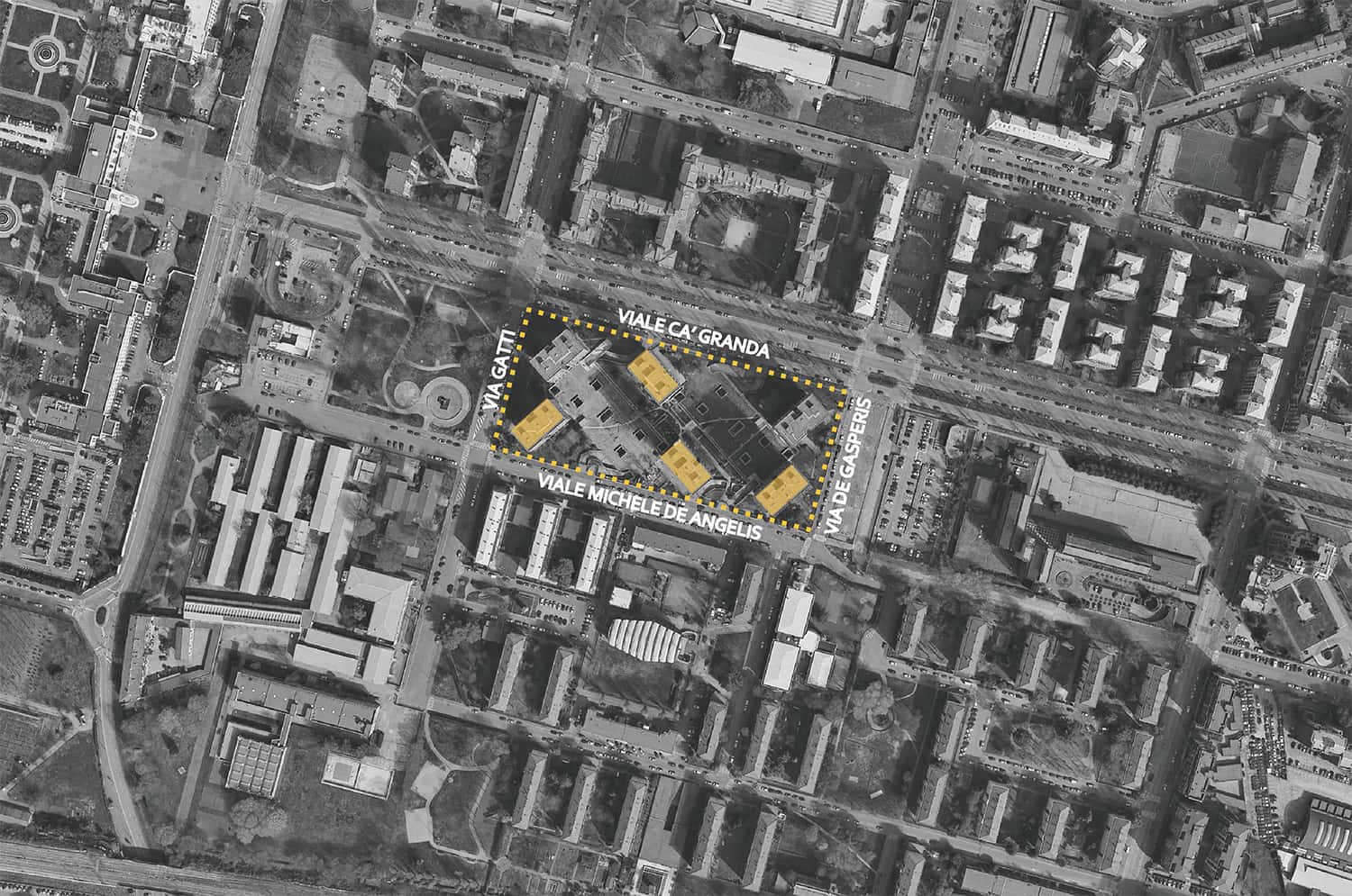
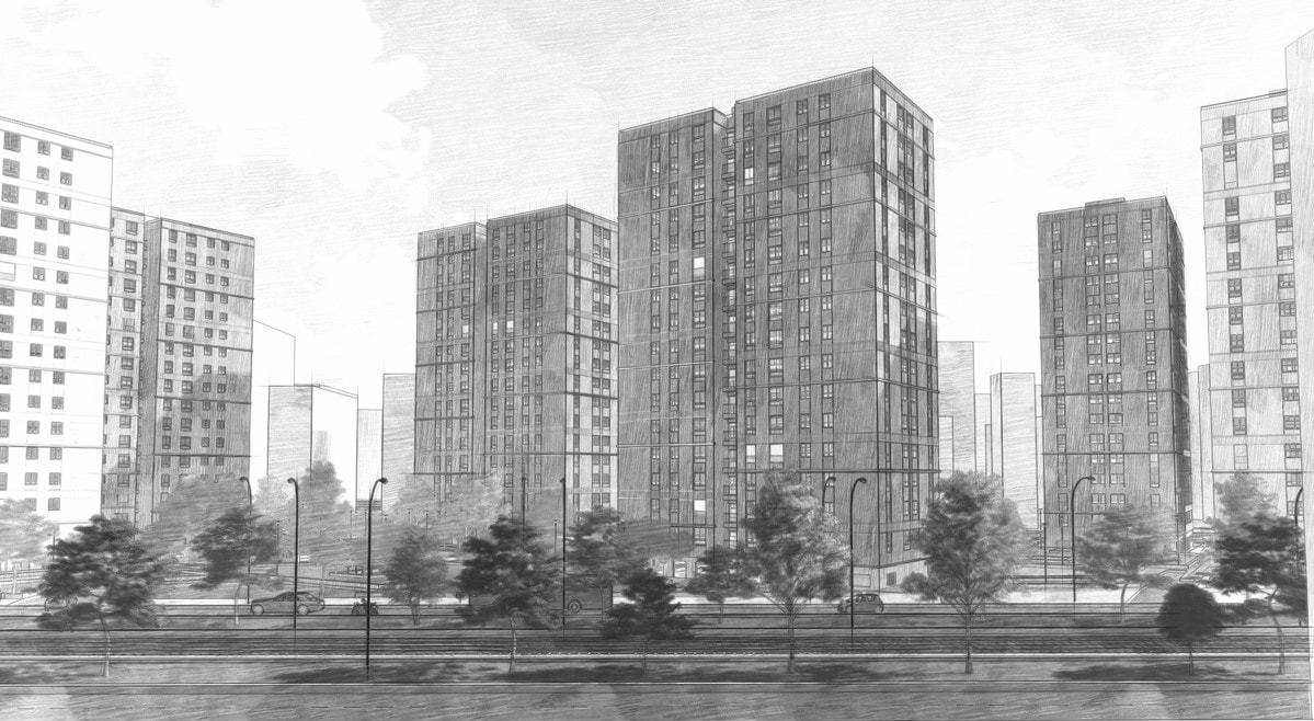
Designed and built by the IACP Technical Office in the 1970s, the six towers of the Cà Granda Sector feature a diagonal site orientation to the site, unique to the area, and a vertical cut of the stairway galleries dividing the large main facade in two.
Each contributes to reducing facade impact and its heaviness to the eye, factors that must have felt necessary but excessive even to the original designer.
A NEW FACADE - option 1
Redesigning a new facade is harmonious with the original project and makes its intentions more known. These steps guided the new composition:
1. The vertical cut in the main facade dividing the tower in two is emphasized
2. The new facade respects the rhythms of the existing windows, but is reconfigured on horizontal lines, making the vertical incision more evident: the facade is then redefined by string courses of different sizes and finishing that generate an initial variation and the first movements of light and shadows.
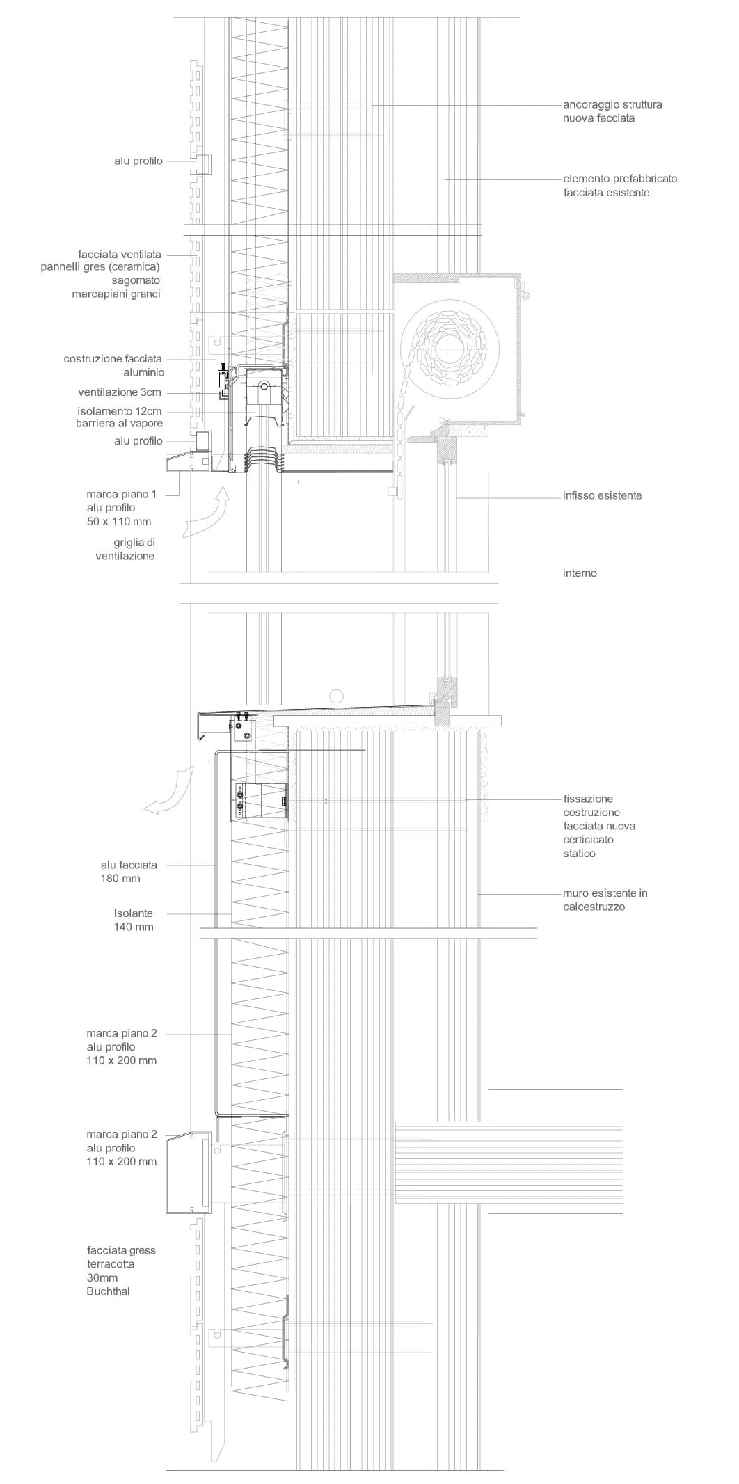
3. The use of a single cladding material positioned by horizontal lines, but unlike the original, makes the wall unsmooth on a single level. Instead, it moves on three different levels, from the string course to the outermost cornice to the innermost wall under the window. This emphasizes the horizontal lines and helps create plays of light and shadows, making the facade less monotonous, more vibrant and changeable in sunlight.
To increase awareness of the two opposing elements of the tower, we have diversified the string courses by creating different rhythms: single and double, allowing the project to restore an urban aspect to a facade that, for necessity or economic considerations, looked very monotonous and abstract.
A NEW FACADE - option 2
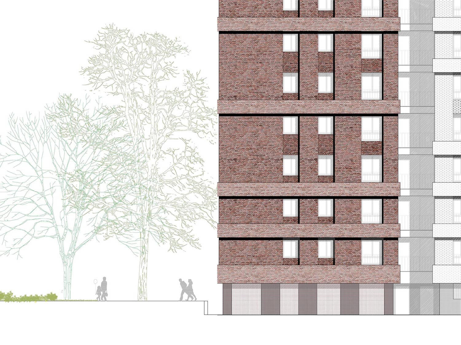
Using different materials, we combine the porcelain stoneware slabs with metal box elements the same color as the new window frames. No new material is introduced, as the metal elements were present in OPTION 1 for both the windows and the stringcourses; however, covering the under-window wall with metal and giving it continuity with a single material, the facade is reconfigured in a different play of high, low, full and empty, increasing the contrasts, lights and shadows.
COLOR AS PROJECT
The towers are located in an impressive natural environment allowing enrichment with additional plants. Appropriately, natural earth colors were chosen, like terracotta and brick, along with more subdued and uniform shades like light gray which pairs well with the darker elements in burnished metal. The whole project aims to dematerialize the large heavy and monolithic parallelepiped of the tower by dividing it into two paired quadrangular shapes. Colors enhance this idea, combining two for each building from a preselected palette.
Designed and built by the IACP Technical Office in the 1970s, the six towers of the Cà Granda Sector feature a diagonal site orientation to the site, unique to the area, and a vertical cut of the stairway galleries dividing the large main facade in two.
Each contributes to reducing facade impact and its heaviness to the eye, factors that must have felt necessary but excessive even to the original designer.
A NEW FACADE - option 1
Redesigning a new facade is harmonious with the original project and makes its intentions more known. These steps guided the new composition:
1. The vertical cut in the main facade dividing the tower in two is emphasized
2. The new facade respects the rhythms of the existing windows, but is reconfigured on horizontal lines, making the vertical incision more evident: the facade is then redefined by string courses of different sizes and finishing that generate an initial variation and the first movements of light and shadows.
3. The use of a single cladding material positioned by horizontal lines, but unlike the original, makes the wall unsmooth on a single level. Instead, it moves on three different levels, from the string course to the outermost cornice to the innermost wall under the window. This emphasizes the horizontal lines and helps create plays of light and shadows, making the facade less monotonous, more vibrant and changeable in sunlight.
To increase awareness of the two opposing elements of the tower, we have diversified the string courses by creating different rhythms: single and double, allowing the project to restore an urban aspect to a facade that, for necessity or economic considerations, looked very monotonous and abstract.
A NEW FACADE - option 2
Using different materials, we combine the porcelain stoneware slabs with metal box elements the same color as the new window frames. No new material is introduced, as the metal elements were present in OPTION 1 for both the windows and the stringcourses; however, covering the under-window wall with metal and giving it continuity with a single material, the facade is reconfigured in a different play of high, low, full and empty, increasing the contrasts, lights and shadows.
COLOR AS PROJECT
The towers are located in an impressive natural environment allowing enrichment with additional plants. Appropriately, natural earth colors were chosen, like terracotta and brick, along with more subdued and uniform shades like light gray which pairs well with the darker elements in burnished metal. The whole project aims to dematerialize the large heavy and monolithic parallelepiped of the tower by dividing it into two paired quadrangular shapes. Colors enhance this idea, combining two for each building from a preselected palette.